
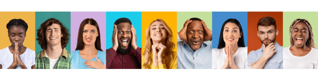
There is no question that the color scheme of a room affects how you feel the moment you walk in! Color psychology and Feng Shui confirm that different hues influence our behavior, emotions, perceptions, and even our “impressions of people”.
Marketing, advertising, branding, and interior design all rely on this concept because colors speak a language of their own.To some extent, our brains are wired to associate different colors with different emotions and sensations.
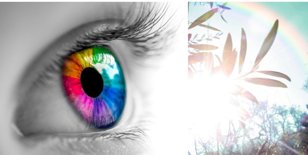
But What is Color?
Visible light is only a small portion of the electromagnetic waves emitted by the sun. Visible light is the color spectrum we see with our eyes. Color, then, is what you perceive when you look at different wavelengths of light. In the electromagnetic spectrum, red light has the longest wavelength, while violet light has the shortest. The other beautiful hues reside between these two magnificent colors.
Lets take a closer look at:
Three Reason Why We Emotionally Respond To Colors
Although colors are commonly associated with certain emotions, they can vary from person to person when designing or decorating. But the general “emotional response” to colors can be attributed to three reasons:
1. Based on Human Evolution
It is interesting to note that color perception has been ingrained in us since the beginning of time and is part of our nervous system. It is a part of our species’ evolution! As early humans, we used color to identify edible plants and fruits, distinguish objects and environments, and determine whether something was safe.
As a result, our brains associate different colors with different emotions and sensations. For instance, the golden warmth of sunlight or the calming effect of a blue sky. The associations we form are deeply ingrained in our nervous system and influence both our conscious and subconscious behavior.
2. Based On Past Experiences
Our emotions or behavior towards color are also linked to past experiences. For instance, if someone’s favorite toy as a child was green, they might prefer that shade. They may, however, develop strong negative emotions towards the color after experiencing a traumatic event, such as being hit by a green car at some point in their lives.
3. Based On Culture
Each culture has its own symbolism and meaning associated with color, which varies from one to another. White is often associated with purity and innocence in Western cultures, while death and mourning are associated with it in Asian cultures. In African cultures, yellow generally represents wealth and prosperity, whereas in Western cultures, it represents optimism and friendship.
Fascinating Way Color Affects Our Brains And Behaviors
Have you ever wondered why certain colors make you feel happy and energized while others leave you drained and unmotivated? Color’s power is vast! Choosing the right color scheme for a room affects its look and feel, which is why designers use colors strategically.
For instance, Blue suppresses appetite, making it unsuitable for dining rooms or restaurants. Additionally, the color of the walls can affect the taste of food, with warm colors such as red, orange, and yellow making food taste sweeter, while cool colors like blue and green can make food taste bitter!
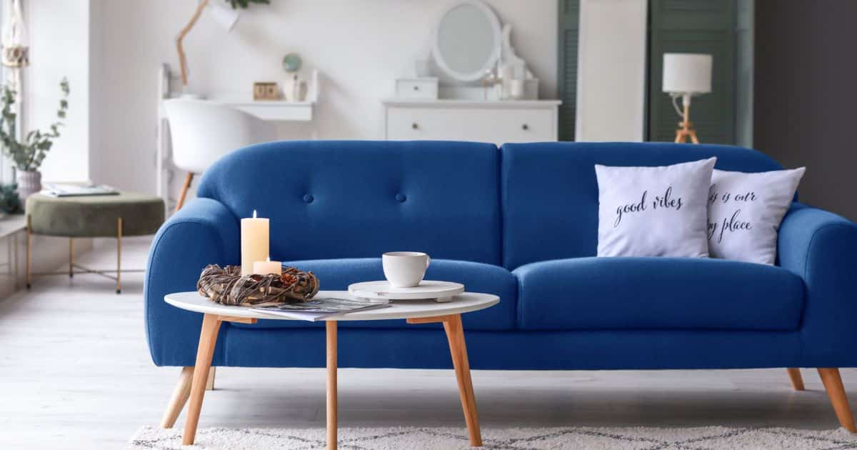
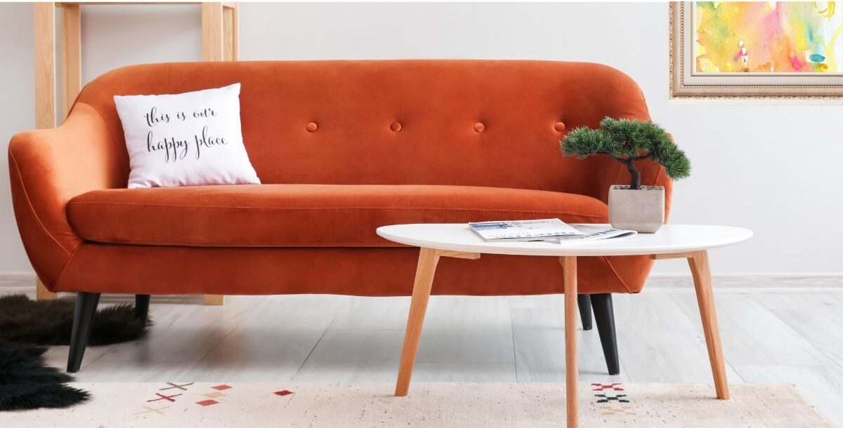
Red, a stimulating color, increases heart rate and blood pressure, making it a poor choice for bedrooms. A spa or yoga studio would benefit from cool colors like blue and green that have a restorative effect. Conversely, if used excessively, they can also make people feel lonely or sad. Warm colors create a feeling of intimacy, while cool colors create a feeling of professionalism.
For this reason, finding the right color balance in a room is crucial to achieving the desired result. Here are three ways to understand how we use color to create a more conducive environment:
2. We Use Colors To Guide Our Emotions.
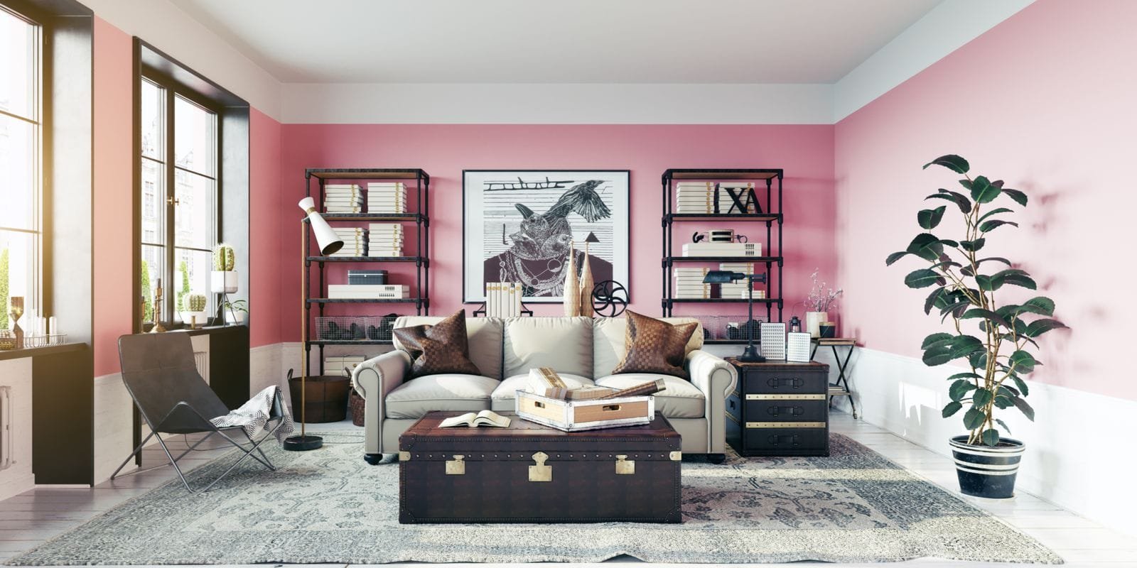
Color psychology is used in many fields, including marketing, interior design, medicine, and even justice system. Colors have different “effects” when applied in different environments, which is quite interesting. For instance, hospitals use green because it soothes, while restaurants use red because it increases hunger. In maternity wards, blue light is used to treat jaundice because it prevents infections. By using color therapy, pink calms inmates by reducing anxiety and stress.
3. Colors Energy Impacts Us Beyond Sight.
Although some people might think that color can only be seen by those with functioning eyes, research has shown that even blind individuals can perceive colors. It has been reported that some blind people can tell colors apart by observing how they feel when touched. As an example, blue is often described as soothing and cool to touch, while red is energizing and warm.
Feng Shui Color Insight: A Fascinating Look At Balancing Yin And Yang!
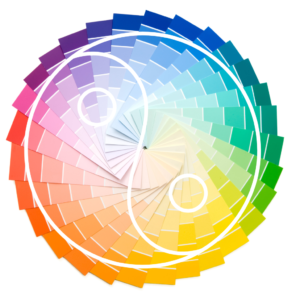
Yin and Yang are two opposite but complementary forces that make up the universe. This is an interesting concept if you really think about it! Yang is active, expanding, masculine, and light, while Yin is passive, contracting, feminine, and dark. One is not better than the other, and one cannot exist without the other. The concept of light wouldn’t exist without darkness, for instance.
Feng Shui design considers these two forces as guides for balancing the overall energy of a space. In order to achieve this, one can use color, since each hue has an underlying energy of Yin or Yang.
Too much yin energy in a space can make one feel lethargic and depressed while too much Yang energy can make one feel anxious and stressed.
Thus, a harmonious energy flow within a space relies on color balance. Furthermore, since each color has its own unique energy, it is transmitted into a space at a specific frequency. This is where its vibration impacts the emotional and energetic state of those occupying the space.
Designing a space that aligns with your overall goal and intention is effortless when you use Feng Shui as your guide.
What Does Your Color Say About You?
Using color is a powerful way to express oneself. It provides insight into how people perceive themselves and the world around them.
Color choice can reveal our current state of mind and personality. For example,
- People who prefer blue hues are usually introspective and thoughtful, while those who prefer fiery reds are usually passionate and dynamic.
- Bright and pastel colors can make you appear friendly and fun. In contrast, darker hues and muted tones convey sophistication.
- It is possible that someone who wears a lot of one color is doing so to balance out another aspect of their personality.
- The colors people gravitate towards are usually reflections of their own personalities. People who are creative, romantic, and intuitive may be drawn to soft colors such as pink, purple, and light blue. A person who is more organized, structured, and disciplined may prefer neutral colors such as gray, black, and white.
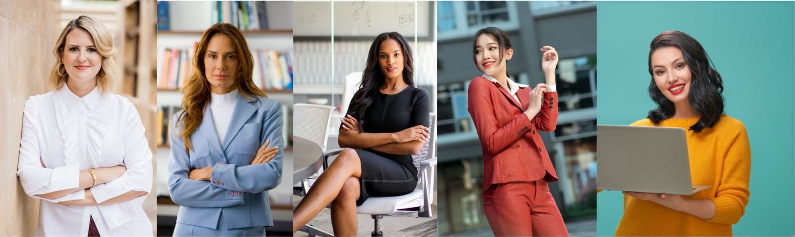
In addition to influencing our perceptions, the color of our clothing also affects how others perceive and interact with us.
- A bright yellow shirt may make you feel more confident and expressive, and people may respond to you in the same manner.
- A red blazer may make people more inclined to approach you, since it conveys an outgoing and vibrant personality.
- You may be perceived as professional and competent if you wear a darker color suit to a job interview or business meeting and are treated or responded to similarly. Black, navy blue, dark gray, etc., are often associated with authority, seriousness, and discipline. Bright colors, however, convey playfulness, optimism, creativity, and approachability (yellow, magenta, lime green, etc.).
What Does Color Say About Your Space?
The use of color in design taps into people’s subconscious emotions, associations, and memories. There are certain colors that are recommended for different spaces and atmospheres based on their psychological effects. The colors we choose for our interiors reflect our personalities. Whether it’s bold and vibrant or calming and serene, color speaks volumes!
1. Showcase Their Style and/or Personal Preferences:
Colors are often used to highlight people’s unique tastes and styles in their living or working spaces. Those who are attracted to bohemian style would likely choose jewel-tone blues, purples, or mustards to create an eclectic mix of colors. Conversely, a person with a classic, timeless style might favor neutrals such as white, beige, or soft gray.
2. Symbolism and Meaning:
In various cultures and contexts, colors can serve as powerful symbols. Indian culture, for instance, associates yellow with knowledge. Therefore, someone who values these principles might use yellow in their home library or study. Green, for example, is universally associated with nature and tranquility. Those seeking a calming environment may paint their bedroom in a soothing shade of green.
3. Creativity and Expression:
In any space, color can be used to express creativity and individuality. A fan of pop culture might paint their room with bold, contrasting colors. An ocean lover might paint their room blue and white, creating a coastal theme that makes them feel like they’re living in a beach house.
Here are some fun color hacks, tips, and tricks.
The following tips and tricks will help you have fun with color and use it to your advantage:
- Paint the front door red – says welcome in, our home is lively! Add Magenta Flowers to a space to instantly uplift its energy and make it vibrant!
- Use orange to create an instant lively atmosphere for gatherings and parties!
- Use yellow (accents) in your kitchen to stimulate appetite! It also makes a room look more spacious and brighter!
- For a sophisticated look and slimming effect, wear black to formal events.
- Purple can make you stand out in a crowd or at a party.
- Use orange as a motivating and energizing color in your gym (hint: orange theory).
- A fresh start is symbolized by white, a color that symbolizes purity and peace.
- Purple is associated with wealth and royalty; it’s not a bad color for a car, either!
- Purple is also linked to spirituality and intuition, so incorporating it into your meditation or yoga space enhances focus and inner connection.
- Use turquoise in your home or jewelry to bring positive energy.
- Splash some green in your bedroom! Known as a restful and calming color, it can creates a peaceful sanctuary for relaxation.
- Wear brown to evoke a sense of reliability and strength. Using earthy colors like brown, ochre, terracotta, and beige at home creates stability and a sense of grounding.
- Use light blue in your office. It’s been shown to increase productivity and create a serene and focused workspace. Also wearing blue can make workplace a little less chaotic.
- Paint one wall in your room a bold color like deep turquoise or charcoal gray to create a feature wall. It can add a pop of energy and make the room feel unique and dynamic.
- Use cream color in your dining area. It’s warm, inviting, and pairs well with almost any other color, especially wooden furniture.
- Rich emerald green, paired with gold accents or antique furniture, creates a jewel-toned, luxurious environment that exudes elegance and sophistication that resembles high-end estates or chic boutique hotels.
- Soft Champagne: For a lighter, airy luxury, a soft champagne color is an excellent choice. It’s subtle, elegant, and when used with white and gold accents, it brings a clean, bright, yet refined aesthetic to any space. It’s often used in high-end beach properties or luxury lofts.
- Combining Soft Champagne with white gives off an effortlessly subtle yet elegant aesthetic, offering a bright yet refined touch perfect for emulating the ambience of a luxury loft or an upscale beachfront property.
- Wear clothing with red accents for a job interview. Red is associated with power and can help you project confidence.
- Use a pop of neon in your workout space. These energetic colors can invigorate your exercise routine and keep you motivated.
- Decorate your children’s study area with pastel colors. These tones are gentle on the eyes and can help to promote focus and creativity.
- Use yellow accents in a room to bring sunshine and cheerfulness into the space.
Point Of Alignment
It is not necessary for a space to be saturated with one color in order to make an impression. By using accent colors in drapes, throws, lighting, pillows, lamps, stained glass, murals, paint, and art, the room will have the same effect, depth, and personality without overdoing it.
If you are using only one color in your design or a monotone palette, try using different shades of the same color with different textures and patterns. This will add depth to your design and make it look more interesting, alive, and three-dimensional.
Art, design, fashion, or nature are all full of color. Understanding color’s unspoken language is key to creating inspiring living spaces, whether for work, rest, or play.