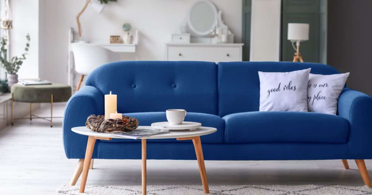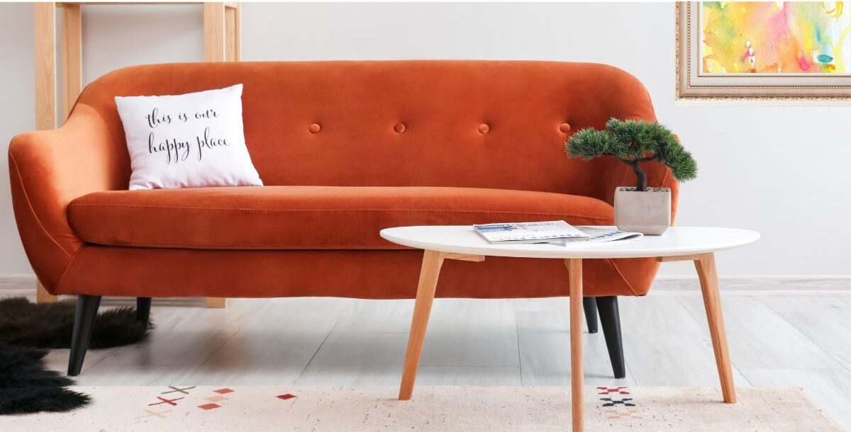

A good way to understand and apply colors in design is to grasp their temperature, meaning the warmth or coolness of a hue. Warm color shades encompass red, orange, and yellow, while cool colors comprise blue, green, violet, and so on. Interior designers use the color temperature of colors to convey specific emotions, create a cohesive look, and establish the desired ambiance in a space.
One of the key features of warm colors is their ability to advance visually. This means they tend to come forward or appear closer while cool colors have the opposite effect, and tend to recede or appear further away.
Warm colors serve as effective focal points in designs and can convey energy and excitement. This makes them ideal for areas that need to draw attention or feel vibrant, like living rooms, restaurants or retail spaces. On the other hand, cool color shades create a calming and soothing atmosphere, making them ideal for spas and bedrooms where relaxation and tranquility are desired.
Get a fresh perspective of which warm and cool colors work best in different rooms, and when to use them or avoid them: