
One of the key features of warm colors is their ability to advance visually, meaning they tend to come forward or appear closer.
The ability to understand the characteristics and applications of warm colors is a valuable tool in any designer’s arsenal. Adding warm hues to art, design, and interiors creates focal points and draws attention to specific areas or objects.
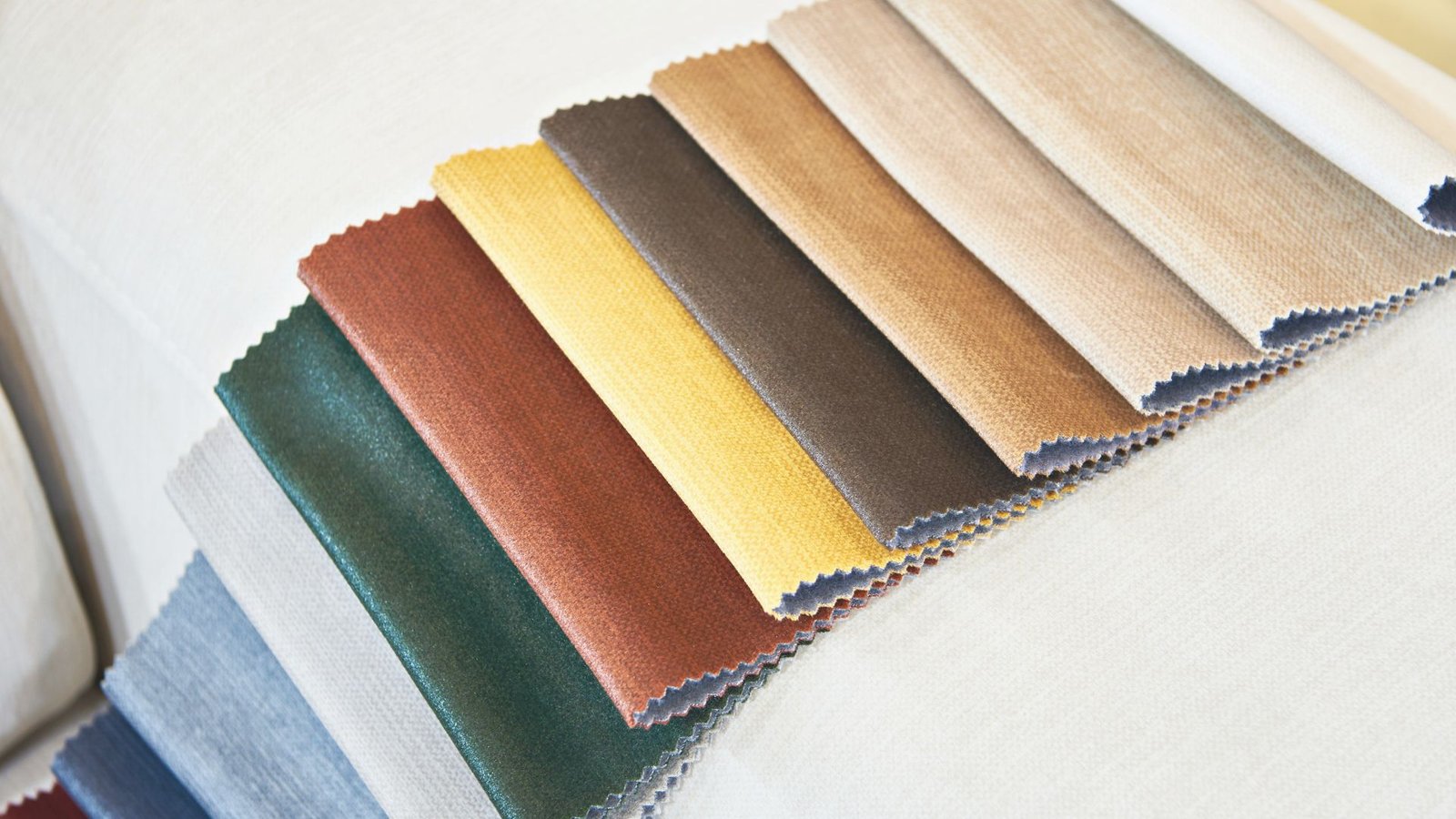
A room doesn’t have to be painted entirely in the suggested color. In fact, the color could be applied to one wall, to wallpaper, or even to furniture, finishes, or decor. Consider the different shades of each color and choose one that fits your space perfectly.
Let’s look at what colors are considered warm, their meanings, and which rooms they suit best and where they should be avoided.
Warm Colors And How They Are Defined:
Red: A bold and energetic color associated with passion, love, and excitement.
Orange: A vibrant and cheerful color that evokes warmth, creativity, and enthusiasm.
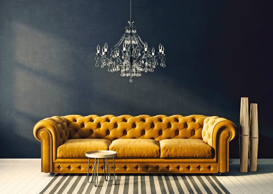
Yellow: A bright and sunny color associated with happiness, energy, and optimism.
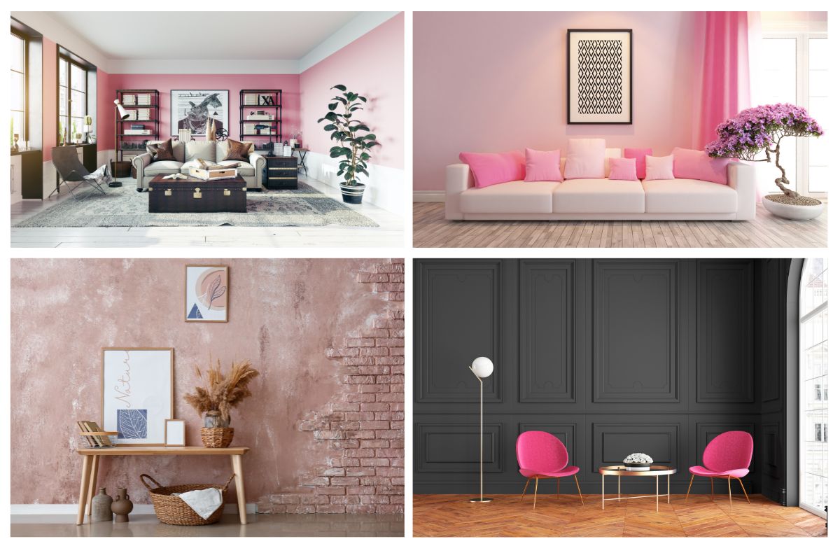
Pink: A soft and delicate color that evokes warmth, comfort, and playfulness.
Brown: A natural and earthy color that creates a warm and cozy atmosphere, often associated with stability and reliability.
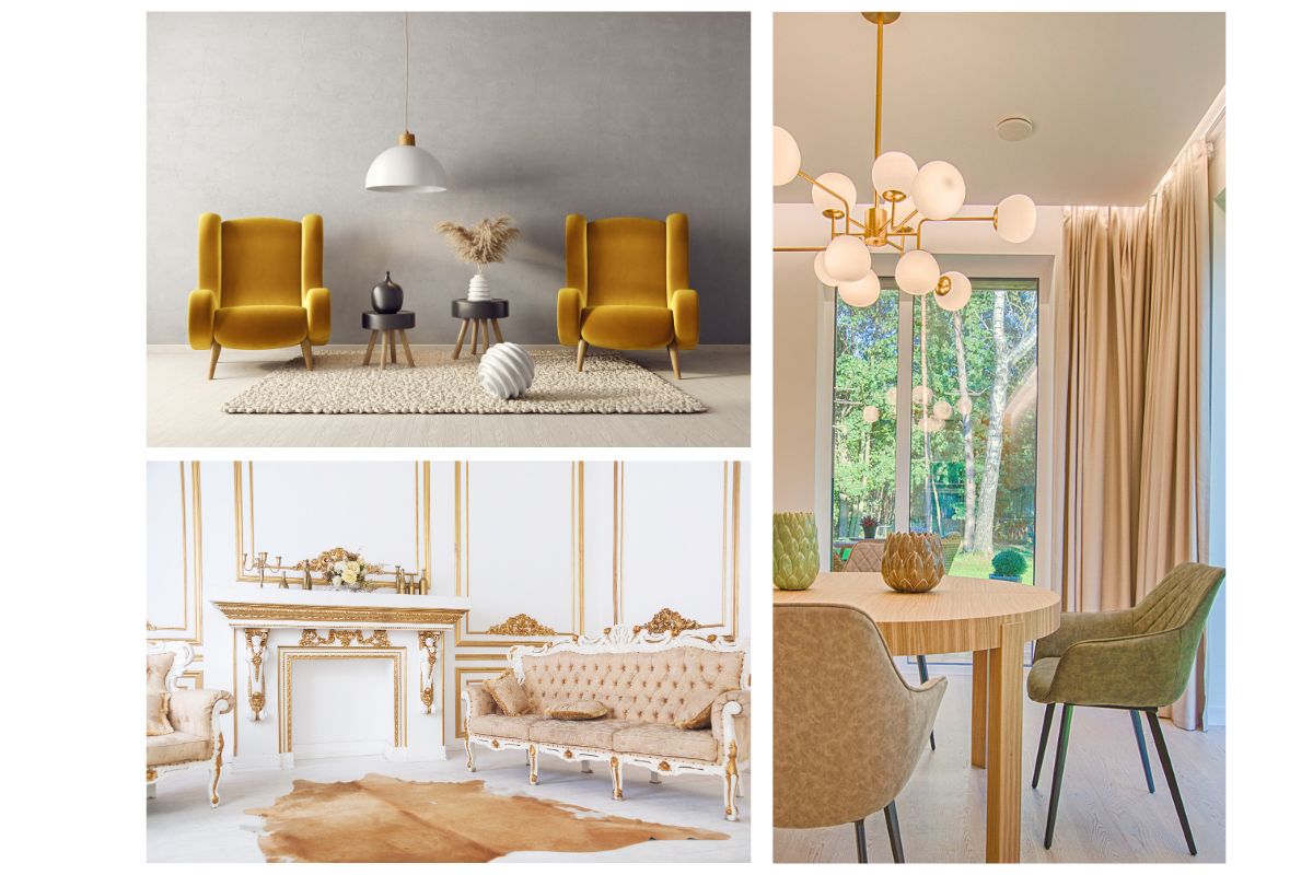
Gold: Associated with feelings of opulence, prosperity, and prestige it evokes a sense of elegance and sophistication.
Black: A powerful and mysterious color that symbolizes power, strength, and sophistication.
Red
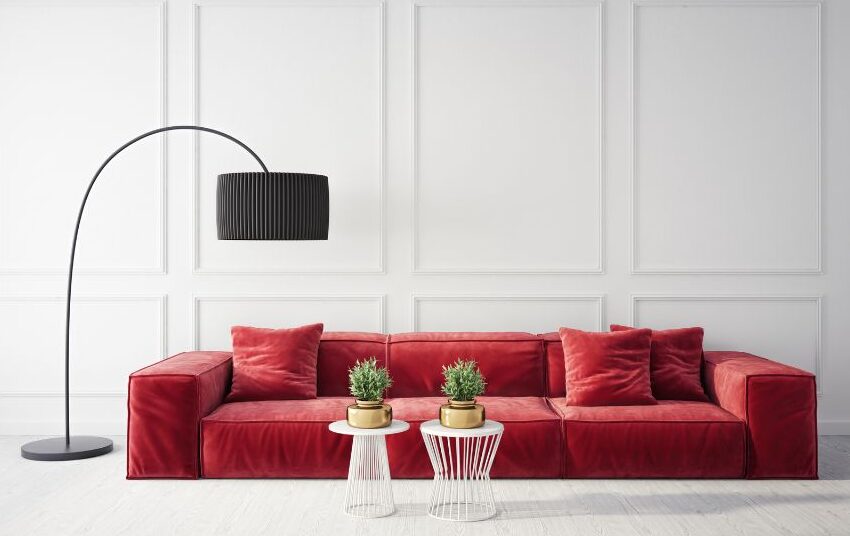
Best Uses Of Red
Home offices or creative studios: Red is an energy booster and stimulates productivity.
Kitchens: Adding red accent pieces to kitchens stimulates appetite, increases energy, and creates a vibrant environment.
Dining Areas: Using red in your dining room furniture, tableware, or decor can create warmth and intimacy.
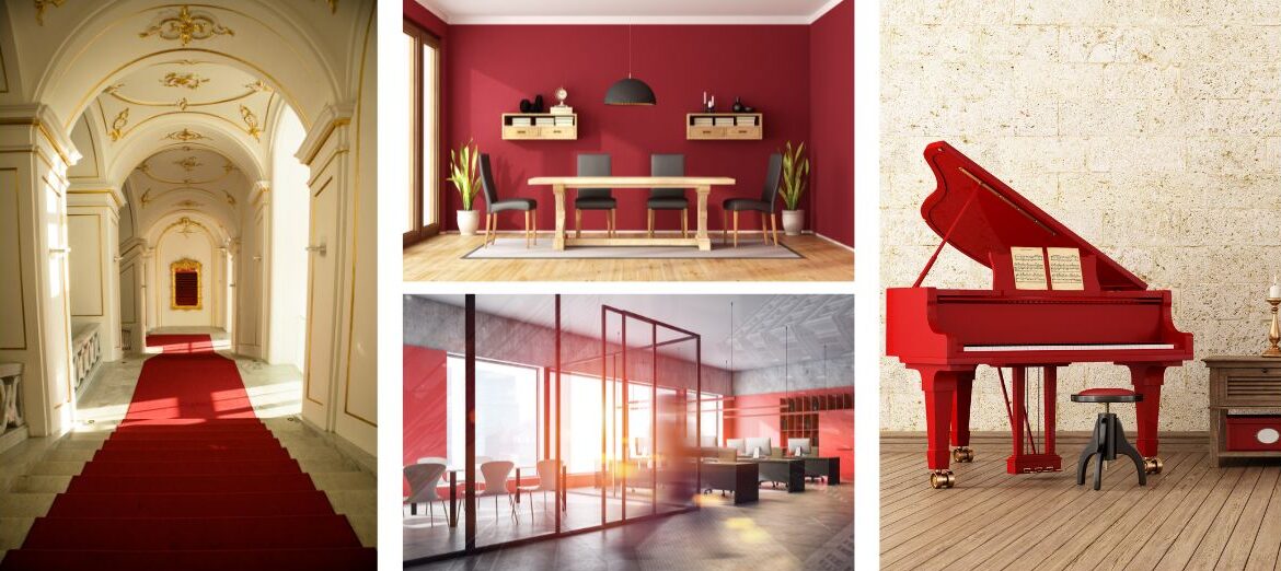
Hallways: Red creates movement and dispels stagnant energy. Add bold, eye-catching flair to your home with red accent walls, artworks, rugs, or lighting fixtures. Additionally, it can be used in commercial spaces for increasing motivation and excitement as people move through the area.
Entertainment Spaces: The color red works well in entertainment spaces, such as game rooms or home theaters.
Areas To Avoid
Bedrooms: As a result of its high-energy nature, red is not typically recommended for bedrooms. It can be too stimulating and interfere with sleep and relaxation. If you’re trying to create a calming and soothing atmosphere in your bedroom, steer clear of red.
Bathrooms: Bathrooms are typically spaces where relaxation and tranquility are desired. A bold and energetic color like red may not create the desired mood of relaxation and serenity in bathrooms.
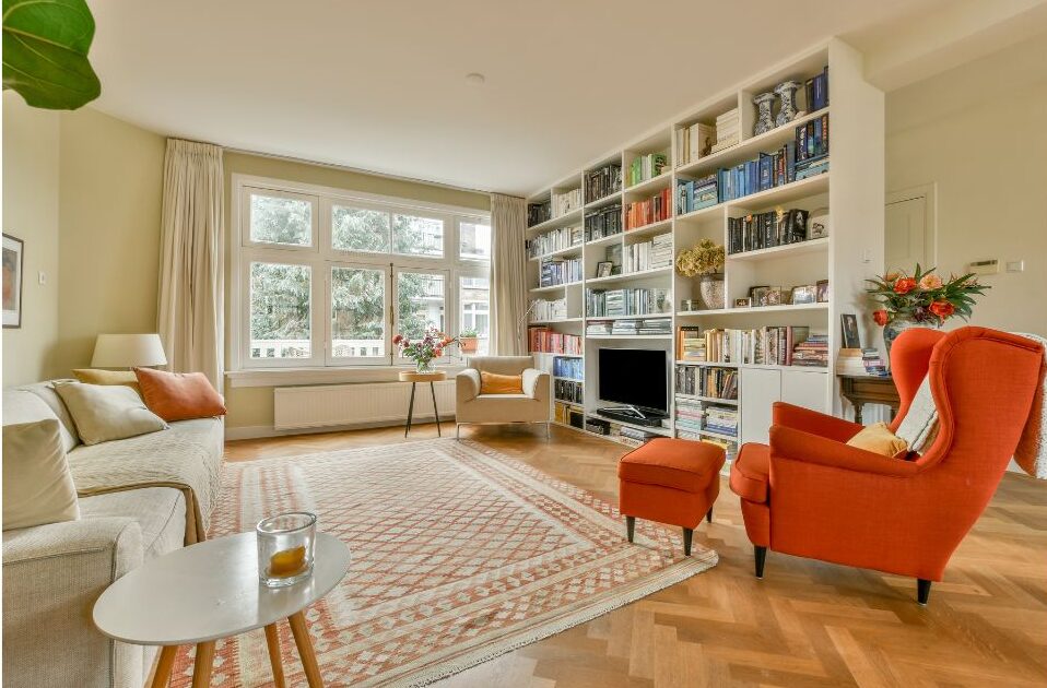
Living Areas: Red is a great accent color for living areas, but it shouldn’t be used as the dominant color in areas where you spend most of your time. In relaxing and socializing rooms, it can overwhelm and create restlessness.
South-facing Rooms: Avoid using red in south facing rooms. Too much red in a south-facing room that receives plenty of sunlight may make the area feel hot and crowded.
Pink
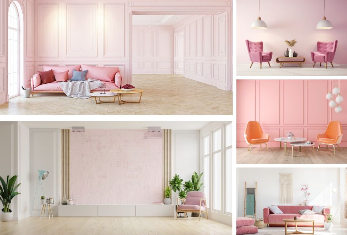
Best Uses Of Pink
Living Room or Lounge Area: Pink shades add a touch of playfulness and warmth to a living room or lounge. When used in furniture, upholstery, or decor, pink creates a sense of femininity, romance, or relaxation.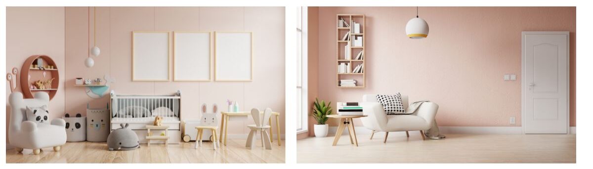
Home Office or Creative Space: Shades of pink add energy, playfulness, and inspiration to home offices and creative spaces. To create a dynamic and motivational environment, it can be used in accent walls, furniture, or decor.
Nursery or Children’s Room: Pink creates a serene and calming atmosphere in a nursery or children’s room. Soft pink is often associated with innocence, tenderness, and comfort, making it a perfect choice for creating a safe and nurturing environment.
Salons & Spas: Pink hues also convey feelings of relaxation and femininity if used in beauty salons or spas.
Areas To Avoid
Kitchen: It is worthwhile to consider potential buyers’ preferences when selling a house. Pink can be perceived as too feminine in a kitchen, so it is not a universally appealing color. Thus, avoid using pink as a dominant color in the kitchen and other main areas.
Formal Dining Room: Because pink can be perceived as too casual or informal, it may not be the best choice for a formal dining room. Color palettes in formal dining rooms are typically sophisticated and elegant.
Master Bedroom: Pink shades may look serene and calming in a nursery or children’s room, but they may not be the best choice in a master bedroom. It may not be a preferred sleeping space for everyone due to its association with femininity, depending on both partners’ comfort and preferences.
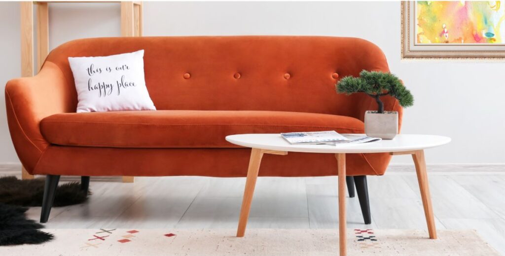
Orange
Best Uses Of Orange
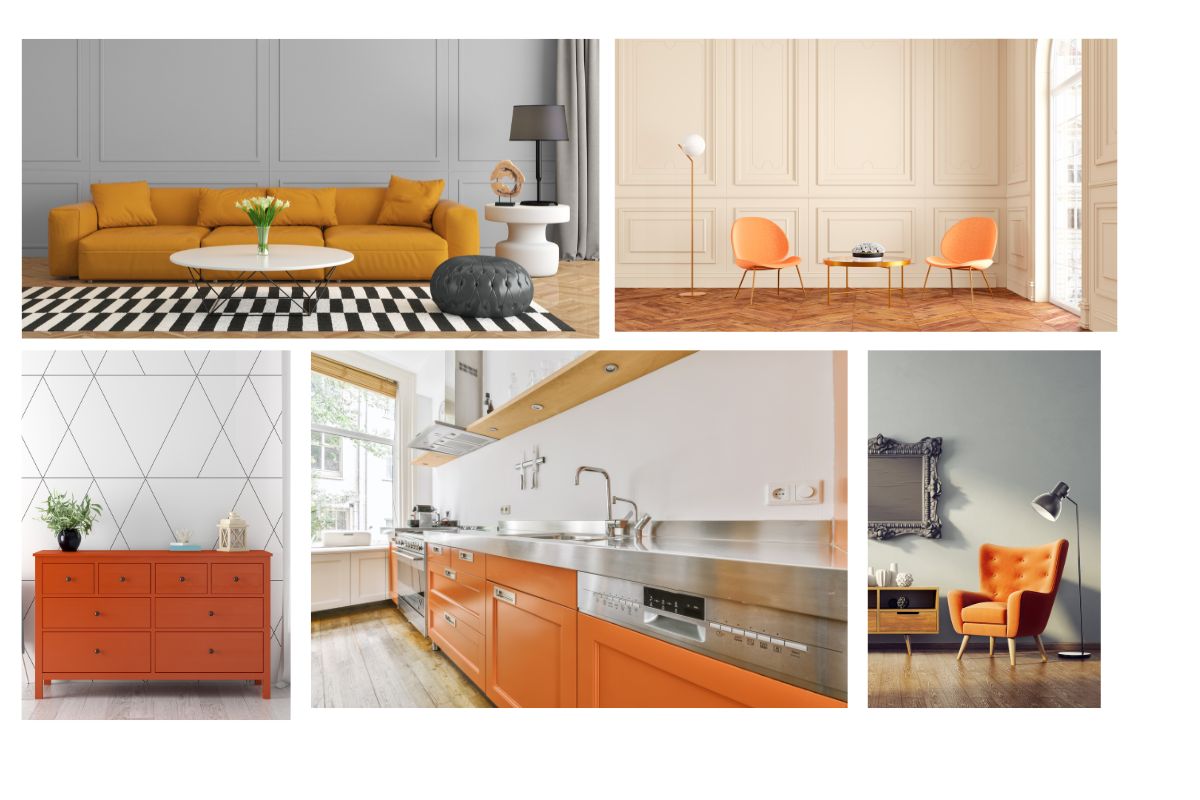
Entertainment or Game room: Orange is vibrant and cheerful with a playful and fun vibe. Because it stimulates creativity, it is an excellent choice for a space where children or adults can engage in imaginative play and activities.
Exercise or Fitness Areas: Orange enhances energy levels, motivation, and enthusiasm, which is perfect for gyms, yoga studios, or work-out areas. To avoid overwhelming the space, orange should be balanced with other calming colors. Adding it to accent walls, gym equipment, or fitness accessories will increase your energy levels and make your workouts more enjoyable!
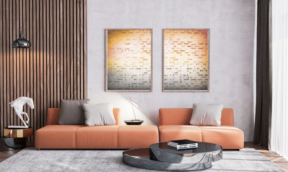
Social Spaces or Entertainment Areas: Orange is often associated with sociability, so it works well in living rooms, dining rooms, and home bars. It can be used as an accent wall, furniture, or decorative accessory. The color orange encourages conversation, interaction, and warmth, while also creating a welcoming atmosphere at parties and gatherings.
Creative Spaces: In creative spaces, such as art studios and craft rooms, it can enhance productivity and creativity.
Areas To Avoid
Bedroom: Orange is an energetic color that is not appropriate for a bedroom where relaxation and rest are the primary goals.
Office or Workspace: In professional settings, such as offices or workspaces, orange may be perceived as too bold or overwhelming and may be distracting. A bright orange wall, for example, can overwhelm, resulting in a lower level of productivity.
Rooms with lots of natural light: Orange intensifies in natural light. Orange can feel overwhelming and overpowering in rooms with a lot of sunlight, so take natural light into consideration when choosing this color.
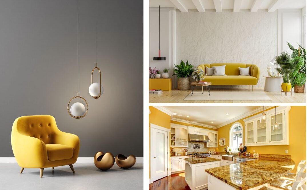
Yellow
Cheery, optimism, fun, joy, wisdom, knowledge, enlightenment, intelligence.
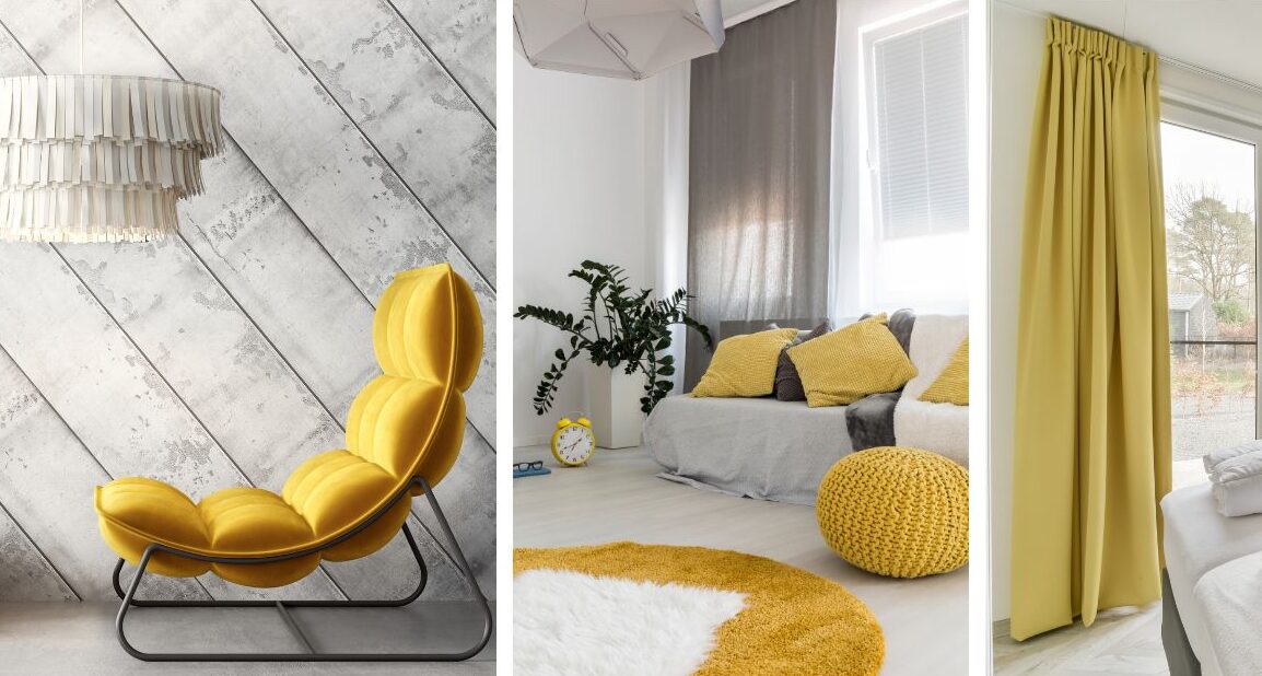
Best Uses Of Yellow
Kitchen: Yellow accents add a touch of happiness and stimulate appetite while creating a welcoming atmosphere. You can use it with accent walls, cabinets, backsplashes, or accessories in your kitchen.
Children’s Areas: Yellow helps create a warm, positive, and imaginative environment for children, creating a nurturing and stimulating environment for them. Keep any space balanced by avoiding overuse of any one color.
Home Office or Study: Yellow accents are a good choice for a study area or office because they stimulate the mind. When used as an accent color, it adds energy and inspiration. Bright yellow may cause overstimulation and distraction, impairing concentration and focus in large amounts. Consider muted or soft yellows or accent it with other calming colors.
Living Room or Family Areas: A splash of yellow in the living room adds warmth and character to the space. A cheerful and uplifting vibe can be added to walls, furniture, pillows, rugs, or curtains with this fabric!
Areas To Avoid: (Unless Muted Or Minimally Accented)
Baby’s nursery: Bright yellow colors are cheerful, but they can also be quite stimulating, creating an environment too bright for babies or small children to relax or fall asleep in. Also, yellow is more difficult to clean since dirt and stains show up more easily. Too much yellow in a room can cause restlessness and disrupt sleep patterns, especially for sensitive individuals. Due to its high reflectiveness, yellow may be uncomfortable for light-sensitive or migraine sufferers.
Meditation or Relaxation Room: Yellow may not be the best color choice for meditation, relaxation, or mindfulness rooms.
Brown
Nature, earthiness, wholesomeness, nature, stability, and reliability.
Best Uses Of Brown
Library, Study, or Office: Brown can evoke elegance and refinement in a library or study with a refined and classic style. In reception areas and waiting rooms, it can also be used to create a welcoming atmosphere. A warm and earthy atmosphere can be created with brown colors.
Bathroom: The color brown can create a spa-like atmosphere. It pairs well with neutral tones such as white and gray, as well as bright colors like yellow and orange. For a more dramatic effect, brown can also be used to contrast white.
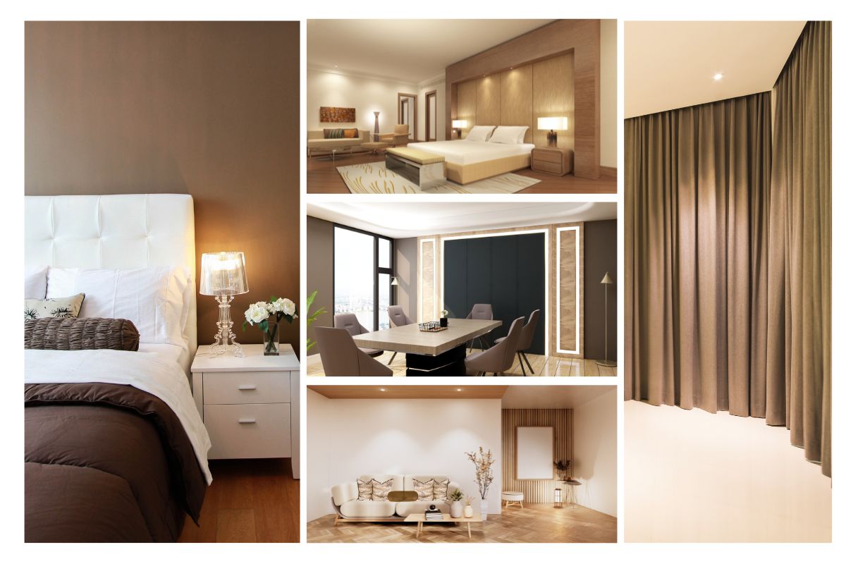
Bedroom: Intimacy and relaxation can be created in the bedroom by light brown shades, like taupe and tan. Combining it with natural textures and earthy tones creates a warm and cozy atmosphere. You can use it as an accent color or as the main color
Kitchen: Brown creates a timeless look. The color pairs well with a variety of other colors, making it a versatile choice. As well as lighter shades, such as pastels, brown works well with greens and yellows.
Areas To Avoid
Small Spaces & Dark Rooms with little natural light: Brown absorbs light and makes dark rooms feel even darker. It may not be the best option for rooms with minimal natural light or limited artificial lighting. Dark shades of brown can make small rooms feel even smaller and darker, so it might not be an ideal choice for tiny rooms.
Children’s playroom: The color brown is generally not a good choice for a children’s playroom since it may not create a vibrant and playful atmosphere.
Gold
Wealth, luxury, abundance, opulence, prestige, and prosperity.
Best Uses Of Gold
Entranceways and Hallways: Adding gold to an entranceway or hallway creates a sense of opulence and formality. Lighting fixtures, artwork, wall coverings, furniture, accessories, molding, and trim can all be used to incorporate it.
Formal Living or Dining: Gold adds warmth and glamour to formal living or dining rooms. Gold accents can be added to a room in many ways. Gold coffee tables or mirrors, gold-colored lamps and vases, or even fabric and upholstery are examples. You can also achieve a regal look with dining room furniture, table legs, tableware, and chandeliers.
Powder rooms or bathrooms: Gold can be used in powder rooms or bathrooms to create a sense of luxury and indulgence. Adding gold faucets, fixtures, or hardware to these spaces can enhance their elegance.
High-End Commercial Spaces: High-end hotels and upscale restaurants often use gold to create an opulent and elegant atmosphere.
Areas To Avoid
Kitchens: Can be overwhelming and make the space feel too busy and cluttered. Children’s rooms: Gold may appear too formal and overpower the playful atmosphere created.
Small spaces: Gold can be overpowering in small rooms as it reflects light and makes the space feel cramped. It’s advisable to use gold color sparingly in small rooms or opt for lighter shades of gold to avoid overwhelming the space.
Minimalistic or modern spaces: Gold may not always complement minimalistic or modern interior design styles, which typically feature clean lines and a neutral color palette. Thus, make sure the use of gold aligns with the overall aesthetic of the space.
Black
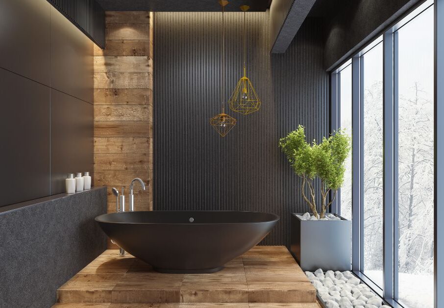
Best Uses Of Black
Living, Dining & Bedrooms: Black accent walls can add depth and sophistication when used in moderation. In a variety of rooms, black can add drama or serve as a focal point on a single wall. You can create a sleek and modern appearance with black sofas, chairs, coffee tables, lamps, and decorative objects. In addition to providing balance and interest, black furniture contrasts beautifully with lighter walls or floors.
Modern Design: The color black can be used in modern and minimalist design to create a sleek and sophisticated look. A distinctive style can be created by using it in fashion stores or high-end boutiques.
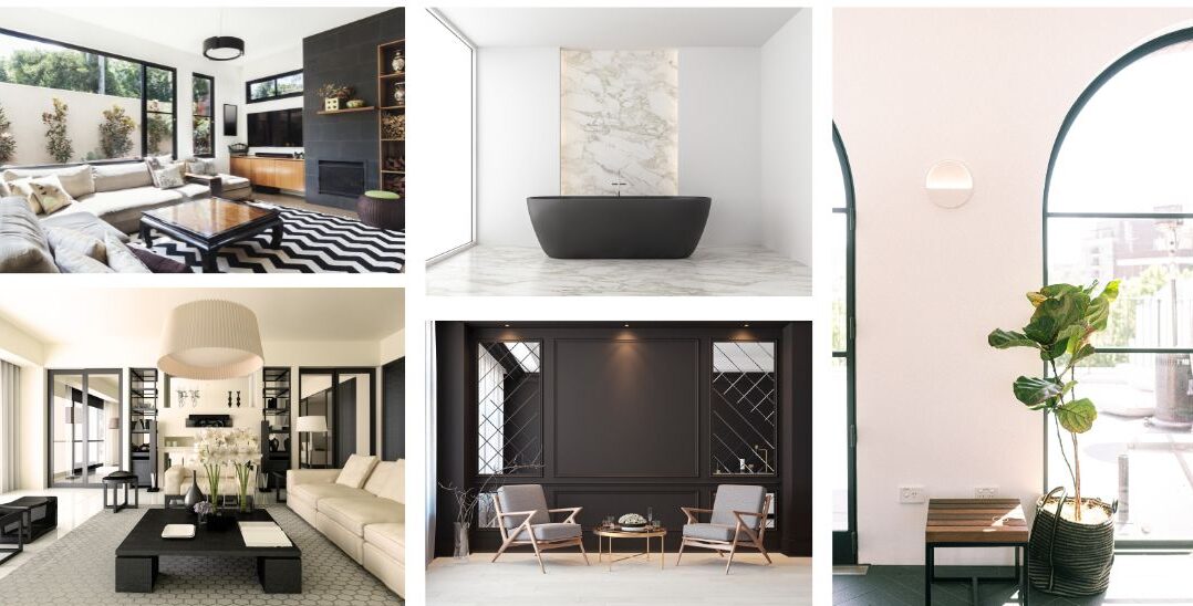
Kitchen and bathroom fixtures: Black fixtures, such as faucets, sinks, or hardware, give kitchens and bathrooms an air of elegance and modernity.
Home theaters or entertainment rooms: Black is often used in home theaters or entertainment rooms to create a cinematic atmosphere by minimizing glare and reflections. The immersive experience of watching movies or playing video games is enhanced by black walls, ceilings, or seating.
Areas To Avoid
Small spaces: Black absorbs light, making small spaces feel even smaller. It is better to use black sparingly as an accent color in a small room rather than using it as a dominant color.
Low-light areas: Black can further dim a space when natural light is limited or artificial lighting is inadequate. It is important to balance black color with appropriate lighting sources so that a dark and depressing atmosphere is not created.
Personal preference: When using black in interior design, consider your personal preferences since some people may find it oppressive, while others may enjoy its dramatic appearance.
Point Of Alignment
It’s interesting to note that black is considered warm in color theory, while white is considered cool. The reason for this is that white is associated with openness and expansiveness, while black is associated with depth and intimacy.
In order to achieve a snug, inviting atmosphere, don’t be afraid to incorporate some black elements. White, however, may be the right choice if you’re looking for an airy, spacious feel!